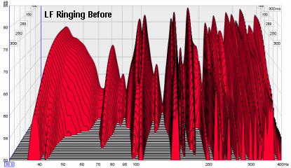
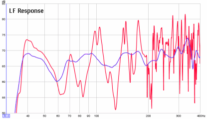
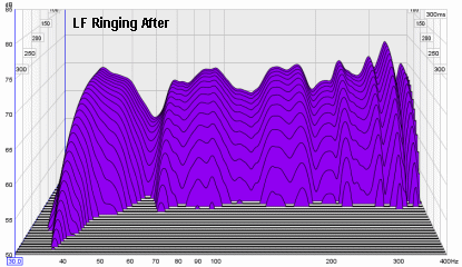
Firstly, this example comes from Ethan Winer at Real Traps. In this example, a small room was treated extensively in a non-obtrusive style.You can see it in his Hearing is believing video.

The improvement is much more than you would expect from this chart. It was a big improvement in tightness and bass control. I have heard many high end systems and the bass I'm getting here is equal to the best I've heard.
How to read these charts
The most important charts shown are the waterfalls. They are simply a frequency response that is measured over time. At the top of the chart you see the response that would normally be measured. Then follow the response as it changes in time, moving down the Z direction as you would if going down a slide.
What would a perfect waterfall look like? You would see at the top a completely flat line with no peaks or dips. You would then see a uniform slope across the entire range that slides down quickly.
You can best identify room modes by noting peaks that decay slower than what you see either side. They become sharper over time because of that slower decay. You can see this illustrated here:
Do you have a result to share?
If so please contact me to share your results. I'd like to share a range of results. If you have already posted online, then feel free to comment with a link below.


Have you had a look at http://www.linkwitzlab.com/frontiers_2.htm where tone burst measurements are preferred, asserting that they present a measurement with less artifacts?
ReplyDeleteThanks for the link Brad. It's always good to question assumptions. I believe the artifacts Linkwitz is referring to are related to CSD plots at higher frequencies. Windowing of the impulse response is necessary to remove the room response so that it doesn't contaminate the data. You might be using a 3ms window. REW uses a much longer time window, because we are investigating the farfield room response. So we don't have this problem when using REW waterfall plots for the room response. Hence for bass frequencies, the waterfall shows us useful data that reflects what we hear. I have found that the waterfall plot is a better predictor of good performance than a frequency response plot. You can have two steady state responses that look comparable, yet sound very different. Look at the waterfall and you will see a measurement that correlates much better with perception. The decay becomes progressively less critical below 100 Hz, yet in my own experiments it has been clear that faster and more even decay below 100 Hz makes a big difference compared even to an untreated room with respectable performance.
ReplyDelete